Giving Huan’s Botanicals a home beyond Instagram messages.
UX Research, IA, UI Design
TEAM
Independent (Solo)
UX/UI Designer
DURATION
1 month (2026)
OVERVIEW
HUAN's Botanicals is a vegetable-tanned leather studio moving from Taiwan into a North American market. The old website sold ready-stock and commissioned pieces from the same page, leaving visitors unable to tell which path applied to them.
PROBLEM
One shop page, three overlapping categories.
With North America now the priority market and bespoke commission the offer it’s built around, browsing needed to be rebuilt from the customer’s decision outward, not from how the products happened to be sourced.
The old Shop & Custom Orders page mixed online and offline channels into a single page. Online purchasing alone split into three paths, bespoke commissions, ready-made pieces, and Pinkoi listings, easy for a visitor to confuse. The brand's in-person presence, at markets and exhibitions, deserved its own page rather than being folded into the mix.
01
Four paths, one page, all at equal weight
02
No clear priority for the main offer
03
Classification followed supply, not intent
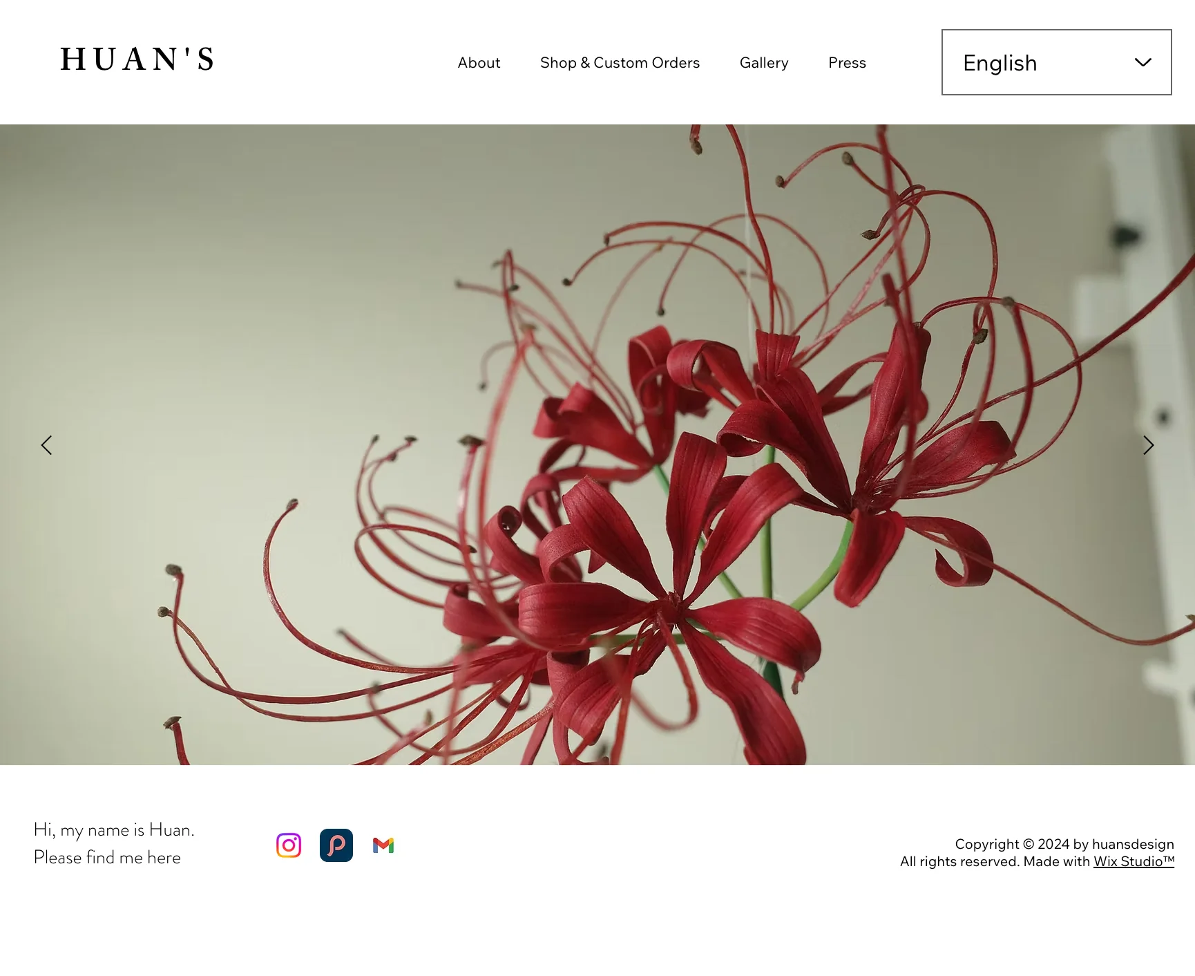
The old Homepage
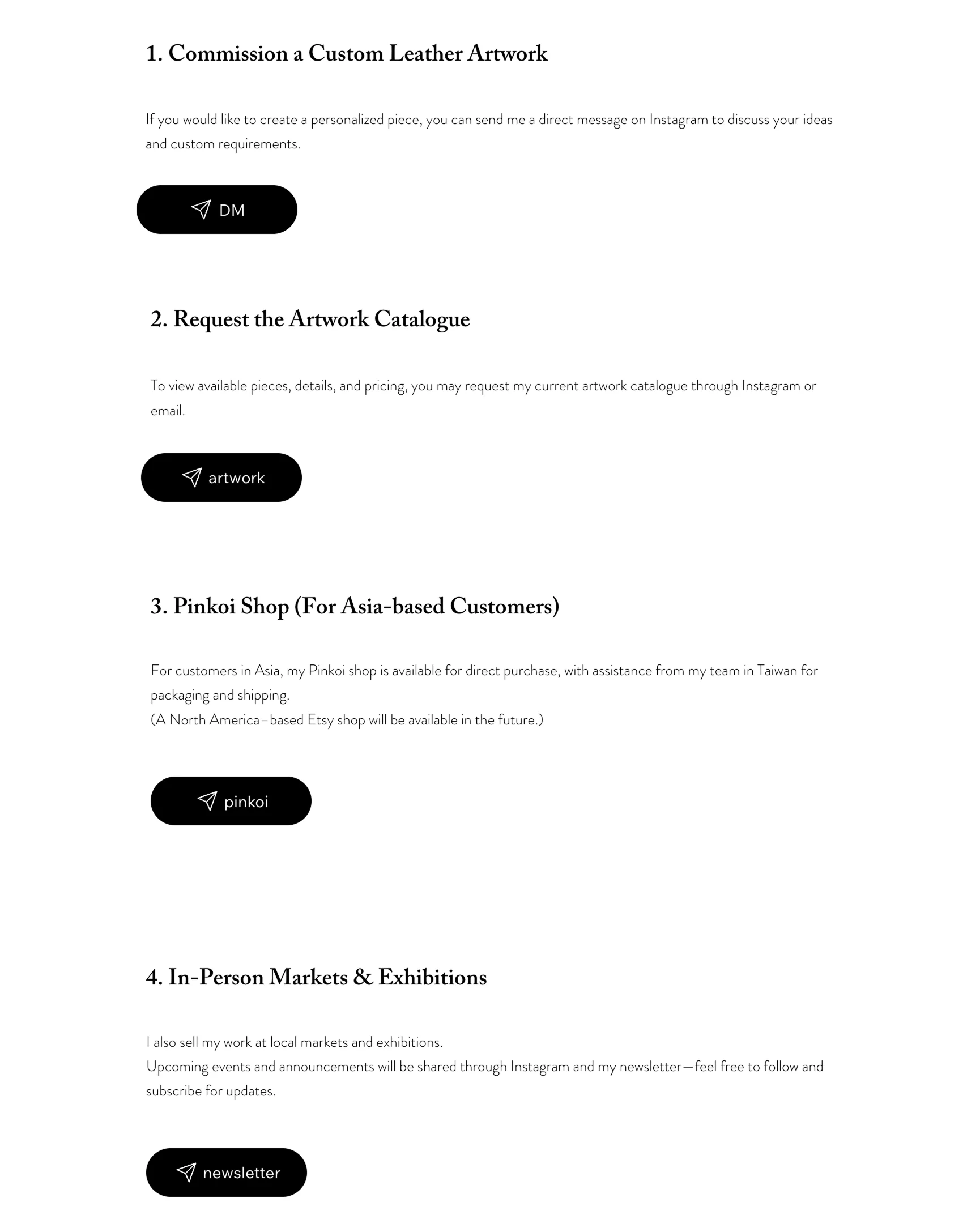
The old Shop & Custom Orders page
RESEARCH
User Interviews: Browsing comes before buying.

Key insight
The site needed to support browsing as the main behavior, not treat it as a step before buying.
Competitive Analysis: Commission needs its own page, and its own trust-building.
Analysis of four high-end maker brands confirmed the direction: premium needs two separate paths, not one. Mixing ready-stock and commission in one shop dilutes the offer. Hesitant clients also need proof before they'll commit, not a blank form on arrival. The brands that converted best led with process, then real client stories, then a form.

Key insight
Commission was pulled into its own page, built around setting expectations early, showing proof from past clients, and keeping the form as simple as possible.
IA: Five entries, each mapped to why a visitor arrives.
The final navigation splits Shop & Custom Orders into Works and Commission, folds Gallery into Milestones to keep the brand's timeline of activity, and merges Press into About since only one of four press pieces had reach beyond Taiwan. In-person markets and exhibitions aren't reflected in the navigation yet, since that side of the brand hasn't launched, but the plan is to fold them into About and the homepage once it does.
Work
browse all; tagged ready / made-to-order
Commission
for those who want to start from scratch
Milestones
the brand’s timeline of work
About
the maker, plus a press block
Contact
get in touch
Key insight
Each entry maps to one clear reason a visitor arrives, not one product type.
DESIGN
Split the site. Keep the grid whole.
Competitive analysis confirmed it: premium needs two separate paths, not one. Commission was pulled into its own page, never mixed with browsing.
Within Works, both sit in the same grid because that’s how visitors actually browse: they scan pieces first, not “in stock” or “made to order” first. Status stays a tag on the card, not a separate section to choose between.

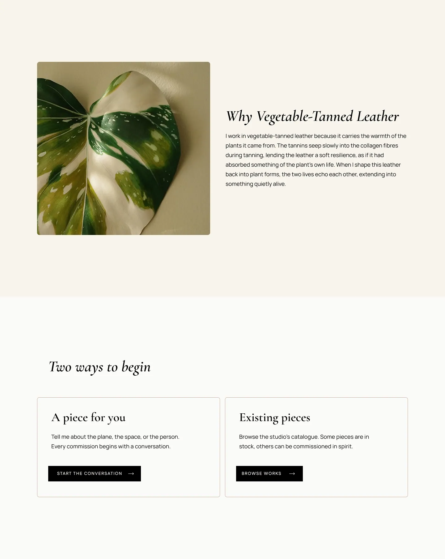
Homepage, one piece leads
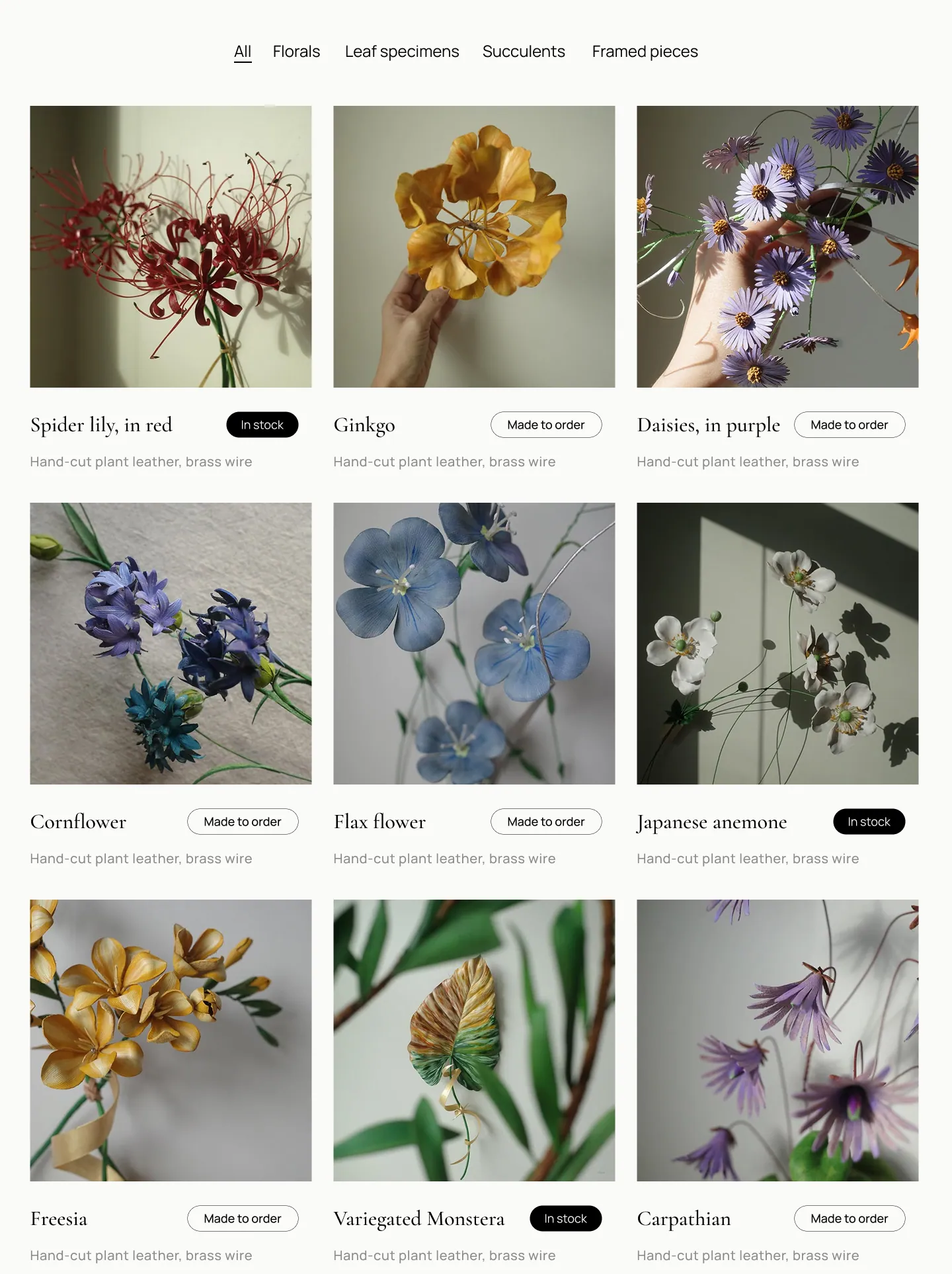
Works page, one shared grid
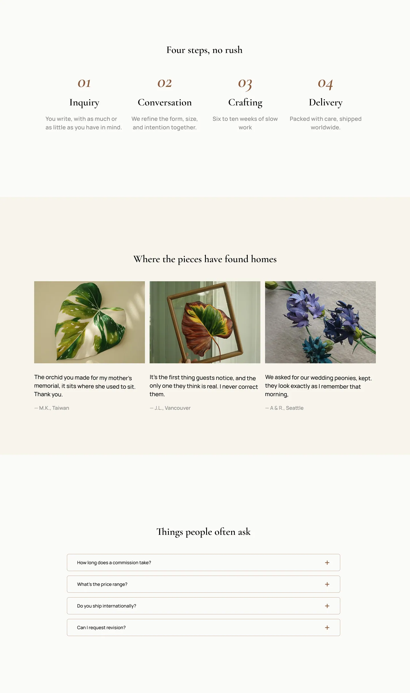
Commission page, proof before pitch
The built, and the system behind it.
Live Prototype

Design System
WHAT I LEARNED
Research still matters, even on a redesign