PROJECT TYPE
Website Redesign
TEAM
4 design interns
ROLE
IA, WordPress
TIMELINE
Jul – Oct 2025
OVERVIEW
WHAT I DID
THE CHALLENGE
Three overlapping problems, buried research value.
01
Navigation inconsistency
Redundant navigation bars and inconsistent dropdown patterns fragment the user journey and make key information difficult to locate.
02
Misaligned content priority
Secondary content (Careers/Donations) over-prioritized, burying core research value and disrupting user intent.
03
Cognitive overload
Repeated content and lack of segmentation increase cognitive load by forcing users to filter through visual noise.

The original ARMI homepage, with the three structural issues annotated
RESEARCH & INSIGHTS
Four interviews surfaced three consistent structural problems.
Based on four user interviews, key issues included confusing navigation, low visibility of research, and limited public engagement. These findings aligned closely with stakeholder concerns.
Key Findings
Overcrowded navigation
Inconsistent menus made it difficult for users to find research groups and key information.
Low visibility of research
Researchers and groups lack clear profiles and structure.
Limited public engagement
Opportunities for students and collaborators are unclear or hidden.
Design Focus
These insights informed the following design focus:
Simplify navigation to reduce duplication and cognitive load
Clarify content hierarchy across public, academic, and industry audiences
Prioritise research groups and people in top-level navigation
Research & user interviews conducted by other team memebers.
RESTRUCTURING THE NAVIGATION LOGIC
Three principles guided the new sitemap.
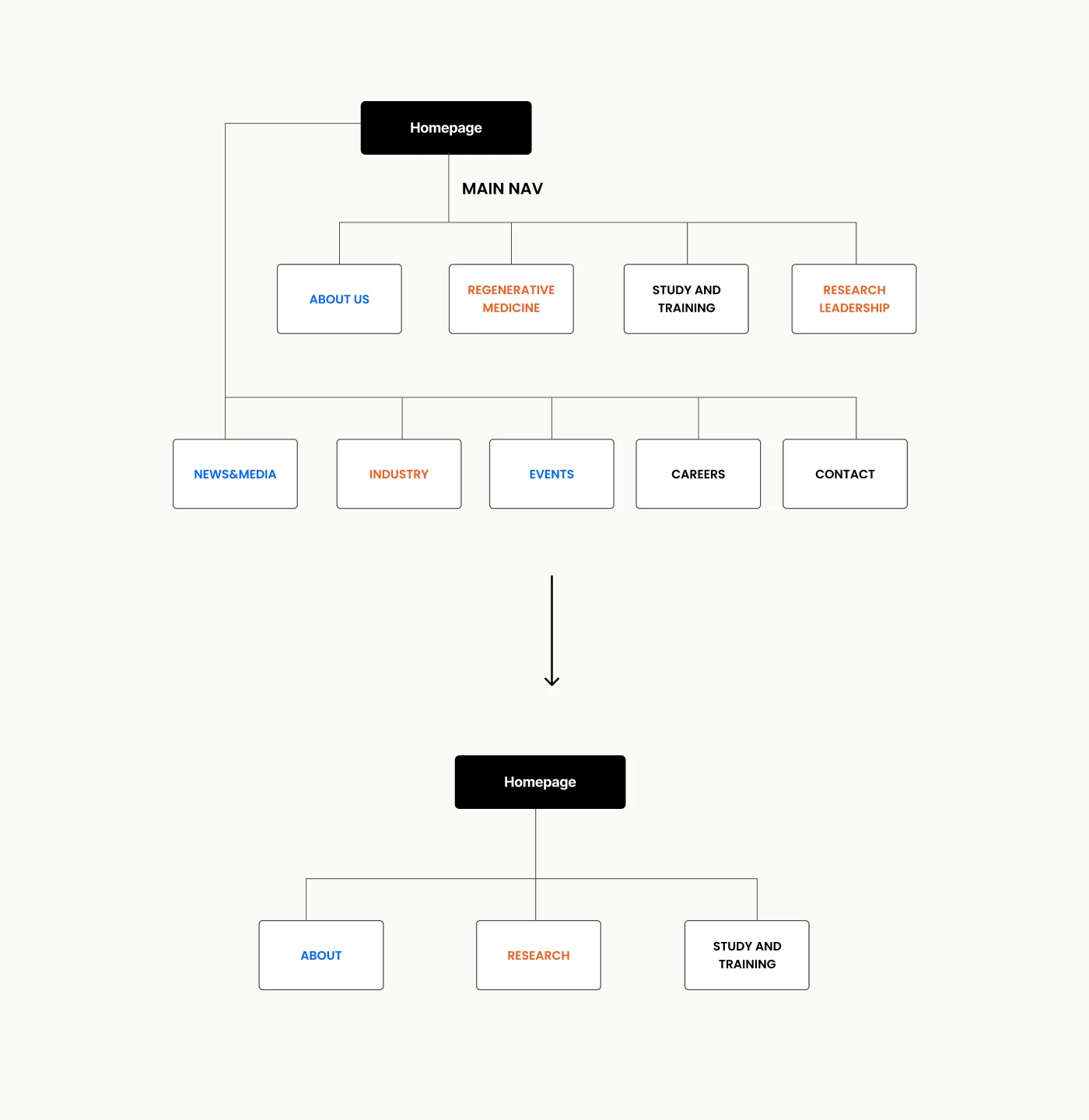
Consolidated Research
Merged 3 scattered entry points into a single ‘Research’ category to help users find core content faster.
Prioritised Intent
Relocated News & Events to ‘About’ to prevent secondary info from competing for attention.
Minimised Noise
Moved Careers and Contact links to the footer to declutter the header and highlight mission-critical pathways.
OUTCOME
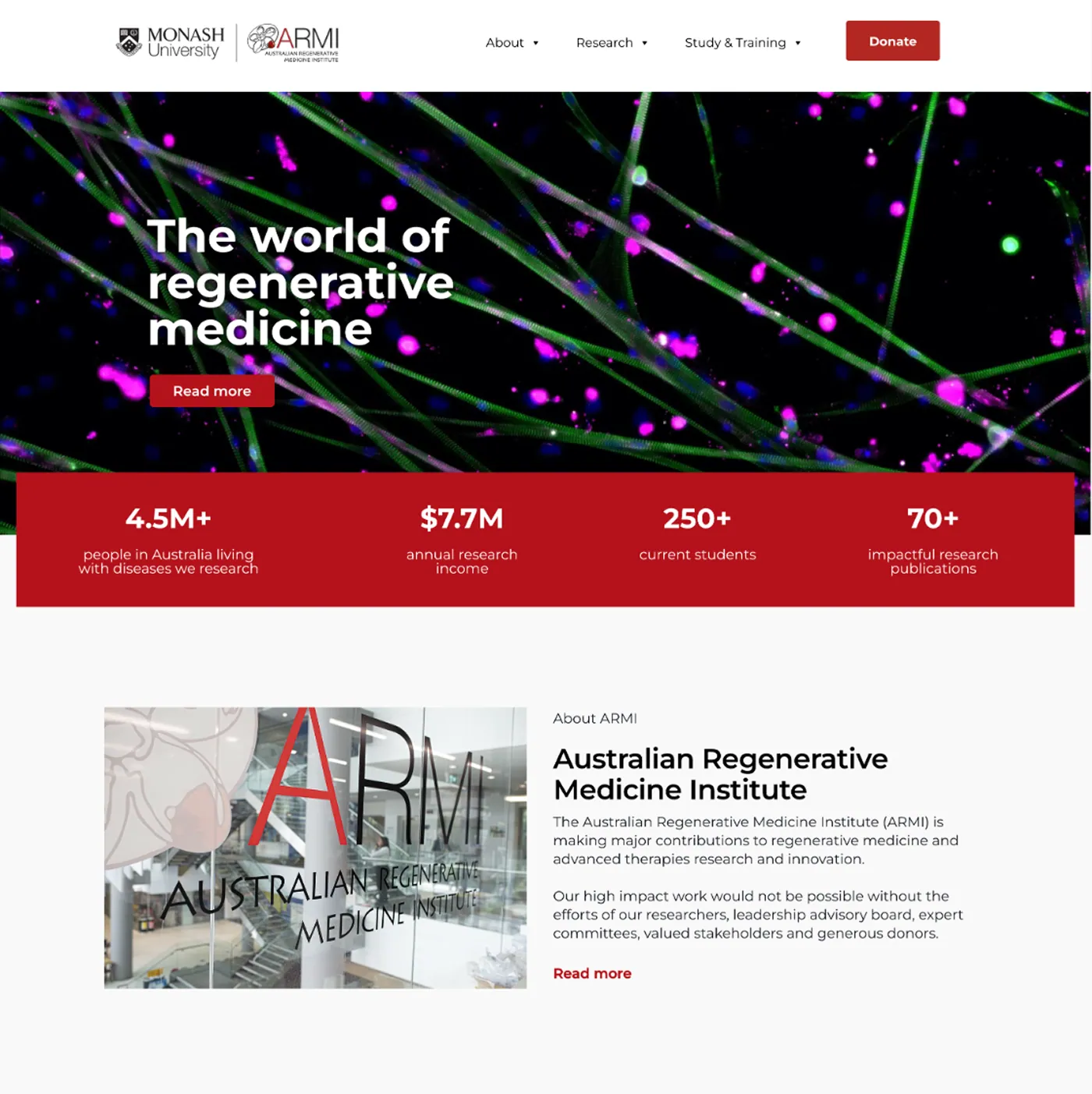
A homepage that leads with research, not admin.
Research now leads the homepage, not donations, not admin content.
BEFORE (BUSINESS-CENTRIC)
High priority given to Donations and Recruitment needs
Research buried below promotional and event content, with no visual priority
9 competing top-level nav entries
AFTER (VALUE-CENTRIC)
Scientific discovery and team profiles immediately accessible
Prospective students and collaborators save 3 to 4 clicks to reach research data
3 clear nav entries: About, Research, Study and Training

From Design to Reality
The existing WordPress theme imposed real limitations such as button text colour couldn't be customised, and predefined templates restricted layout flexibility. Some design decisions couldn't be implemented exactly as intended. Where this happened, I adapted: outlined text-links replaced buttons to preserve visual hierarchy and clarity within what the theme could support.
Structure is a form of trust.
For a research institute, the site’s structure is itself a credibility signal. Consolidating navigation and reordering content priority didn’t just make the site easier to use, it changed what visitors believe ARMI values most, moving research from something buried in the structure.