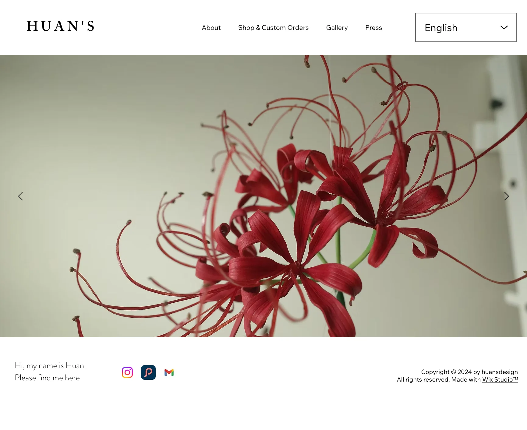
HUAN's

Rebuilding a shop page that asked visitors to choose a purchase path before they'd seen the work.

Rebuilding a shop page that asked visitors to choose a purchase path before they'd seen the work.

Project Type

UX, IA, UI designer

TEAM

Independent (Solo)

MY ROLE

UX/UI Designer

DURATION

3 weeks

OVERVIEW

OVERVIEW

HUAN’s is a vegetable-tanned leather studio moving from Taiwan into a North American market, repositioning at a premium price point. Work spans three types: custom commissions, ready-made pieces, and small-batch production.

HUAN's is a vegetable-tanned leather studio moving from Taiwan into a North American market. The old website sold ready-stock and commissioned pieces from the same page, leaving visitors unable to tell which path applied to them.

PROBLEM

The site wasn’t built to open a new market.

The site wasn’t built to open a new market.

The priority shifted to North America, with bespoke commissions as the core offer. That meant redesigning browsing around how customers decide, not how products were sourced.
For visitors new to the brand, the homepage now had to carry the studio's story and intent, not just imagery.

The priority shifted to North America, with bespoke commissions as the core offer. That meant redesigning browsing around how customers decide, not how products were sourced. For visitors new to the brand, the homepage now had to carry the studio's story and intent, not just imagery.

The homepage

It didn't explain what the studio was or did, leaving first-time visitors with no context before they even reached the shop page.

One shop page, doing four jobs at once

  • Mixed ready-stock and commissioned pieces on one page

  • Split online purchasing into three separate paths

  • Folded in-person markets and exhibitions into the same mix
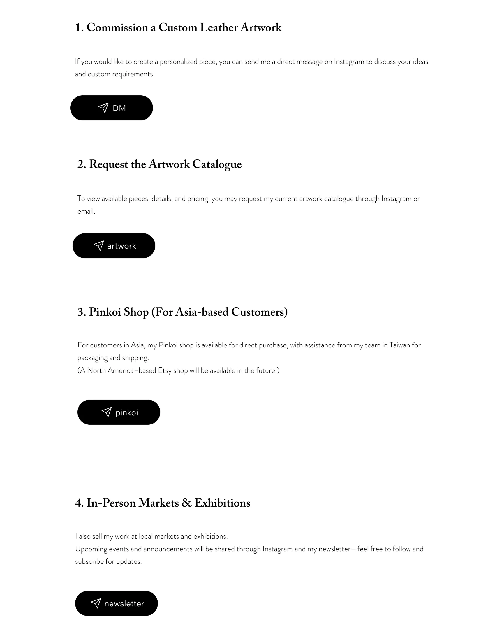
None of it was built with
a first-time, high-intent buyer in mind.

None of it was built with a first-time, high-intent buyer in mind.

RESEARCH

User Interviews:

Browsing comes before buying.

I interviewed three collectors. Their willingness to commission wasn't yes or no, it ranged from collectors who wanted certainty to ones happy to take a risk.

Interviews three collectors showed commission willingness is a spectrum, not a binary, from passive certainty-seekers to proactive risk-takers. But all three shared one behavior: they browse the work first, not a stock status or
a category label. Trust accrues by watching pieces over time, never in a single sales moment.

Two participants both spent time with the work before buying. One participant let that build into enough trust to fully release control. The other wanted the browsing itself to stay in her own hands.

Interviews three collectors showed commission willingness is a spectrum, not a binary, from passive certainty-seekers to proactive risk-takers. But all three shared one behavior: they browse the work first, not a stock status or
a category label. Trust accrues by watching pieces over time, never in a single sales moment.

I've watched her work long enough to just let her create.

I like browsing and picking what I want myself.

The site needed to support browsing as the main behavior, not treat it as a step before buying.

The site needed to support browsing as the main behavior, not treat it as a step before buying.

Competitive Analysis:

Commission needs its own trust-building.

I looked at four high-end maker brands to confirm the direction: premium needs two separate paths, not one. Mixing ready-stock and commission in the same shop dilutes the offer. Hesitant clients need proof before they'll commit, not a blank form the moment they arrive. The brands that converted best led with process first, then real client stories, then the form.

The site needed to support browsing as the main behavior, not treat it as a step before buying. Commission requests had to come after trust,
not before it.

The site needed to support browsing as the main behavior, not treat it as a step before buying. Commission requests had to come after trust,
not before it.

Information Architechture:

Regrouped for faster wayfinding and more visibility for commission.

The final navigation makes three changes: Shop & Custom Orders splits into Works and Commission, Gallery folds into Milestones to keep the brand's timeline intact, and Press merges into About, since only one of four press pieces had reach beyond Taiwan.
In-person markets and exhibitions aren't reflected yet, since that side of the brand hasn't launched, but they'll fold into About and the homepage once it does.

Design

Designed around browsing, not buying paths.

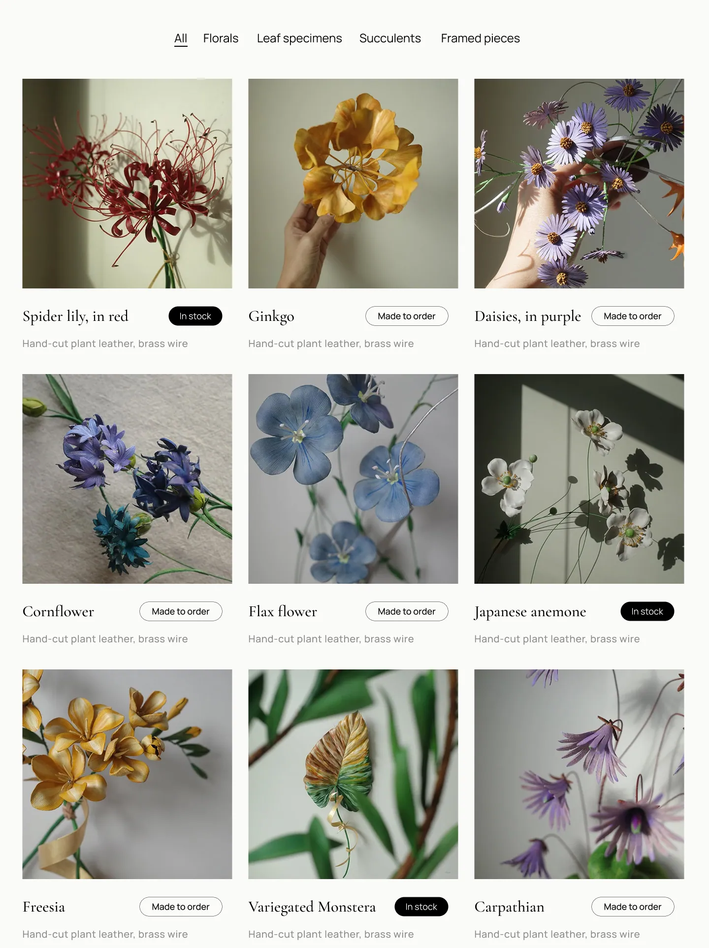
Works

Ready-stock and made-to-order sit in the same grid. Visitors scan pieces first, not stock status, so status became a tag on the card rather than a section to choose between.
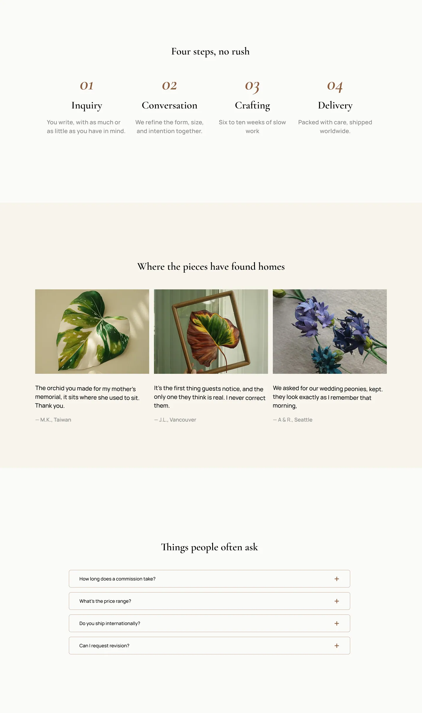
Commission

Process comes first, then past client stories, then the form. Hesitant clients need to see how a commission actually unfolds before they’ll start one, so the four-step timeline and the testimonials both sit above the enquiry form. The form itself stays short, since every extra field is another reason to close the tab.
Homepage

One piece leads, and the studio's craft is stated before anything is sold. This one came from positioning rather than research: a visitor arriving from Instagram needs to know what this studio makes before they're asked to choose a path.


WHAT I LEARNED

Research still matters, even on a redesign

My first pass at this redesign came from talking to the client alone and fixing what I could see was broken on the existing site. I kept the same IA. Something still felt off, though I couldn’t quite name it at the time. Talking to three existing users and looking at competitors changed that. I realised the IA itself was the problem, not the surface details I’d been polishing. That’s what led me to the structure this project ended up with.

I don’t think a redesign needs the same depth of user research a new product or a new assumption would. But I’ve learned it still needs some. My own experience as a designer, however informed, couldn’t cover the full range of a user’s mental model on its own.

My first pass at this redesign came from talking to the client alone and fixing what I could see was broken on the existing site. I kept the same IA. Something still felt off, though I couldn’t quite name it at the time. Talking to three existing users and looking at competitors changed that.
I realised the IA itself was the problem, not the surface details I’d been polishing. That’s what led me to the structure this project ended up with. I don’t think a redesign needs the same depth of user research a new product or a new assumption would. But I’ve learned it still needs some. My own experience as a designer, however informed, couldn’t cover the full range of a user’s mental model on its own.