ARMI

Consolidating navigation and content priority for a university research institute

Consolidating navigation and content priority for a university research institute

Project Type

Website Redesign

TEAM

Team of 4

MY ROLE

IA, WordPress

DURATION

Jul – Oct 2025

OVERVIEW

OVERVIEW

ARMI, the Australian Regenerative Medicine Institute at Monash University, serves researchers, prospective students, donors, and media through one website. The existing site buried the institute’s core research value beneath redundant navigation and administrative content.

HUAN's is a vegetable-tanned leather studio moving from Taiwan into a North American market. The old website sold ready-stock and commissioned pieces from the same page, leaving visitors unable to tell which path applied to them.

WHAT DID I DO

I audited the site's navigation and content hierarchy, identifying three structural problems, then restructured the IA to lead with research. With a teammate, I implemented the new structure in WordPress, adapting components where the existing theme couldn't support the intended design.

HUAN's is a vegetable-tanned leather studio moving from Taiwan into a North American market. The old website sold ready-stock and commissioned pieces from the same page, leaving visitors unable to tell which path applied to them.

THE CHALLENGE

Three overlapping problems, buried research value.

Three overlapping problems, buried research value.

ARMI, the Australian Regenerative Medicine Institute at Monash University, serves researchers, prospective students, donors, and media through one website.
The existing site buried the institute’s core research value beneath redundant navigation and administrative content.

The priority shifted to North America, with bespoke commissions as the core offer. That meant redesigning browsing around how customers decide, not how products were sourced. For visitors new to the brand, the homepage now had to carry the studio's story and intent, not just imagery.

RESEARCH & INSIGHTS

Four interviews surfaced three consistent structural problems.

Four interviews surfaced three consistent structural problems.

Findings from the interviews aligned closely with concerns raised by stakeholders.

Interviews three collectors showed commission willingness is a spectrum, not a binary, from passive certainty-seekers to proactive risk-takers. But all three shared one behavior: they browse the work first, not a stock status or
a category label. Trust accrues by watching pieces over time, never in a single sales moment.

Key findings

Key findings

Overcrowded navigation

Inconsistent menus made it difficult for users to find research groups and key information.

Inconsistent menus made it difficult for users to find research groups and key information.

Low visibility of research

Researchers and groups lack clear profiles and structure.

Researchers and groups lack clear profiles and structure.

Limited public engagement

Opportunities for students and collaborators are unclear or hidden.

Design focus

Regroup

Merge duplicated entries scattered across separate navigation bars

Reduce

Move secondary links out of the primary navigation into the footer

Reorder

Lead the homepage with research, not admin content

Research & user interviews conducted by other team members.

Design focus

RESTRUCTURING THE NAVIGATION LOGIC

Three principles guided the new sitemap.

Three principles guided the new sitemap.

Consolidated research

Merged three scattered entry points into a single Research category so users find core content faster.

Prioritised intent

Relocated News and Events under About so secondary information stops competing for attention.

Minimised noise

Moved Careers and Contact to the footer, leaving the header for mission-critical pathways.

OUTCOME

A homepage that leads with research, not admin.

A homepage that leads with research, not admin.

Priority

Donations, recruitment

Donations, recruitment

Scientific discovery and team profiles

Scientific discovery and team profiles

Research

Below promotional and event content

Visible on the first scroll

Navigation

9 top-level entries

3 entries: About, Research, Study and Training

Research

Below promotional and event content

Visible on the first scroll

Navigation

9 top-level entries

3 entries: About, Research, Study and Training

First screen - impact metrics and institutional credibility.

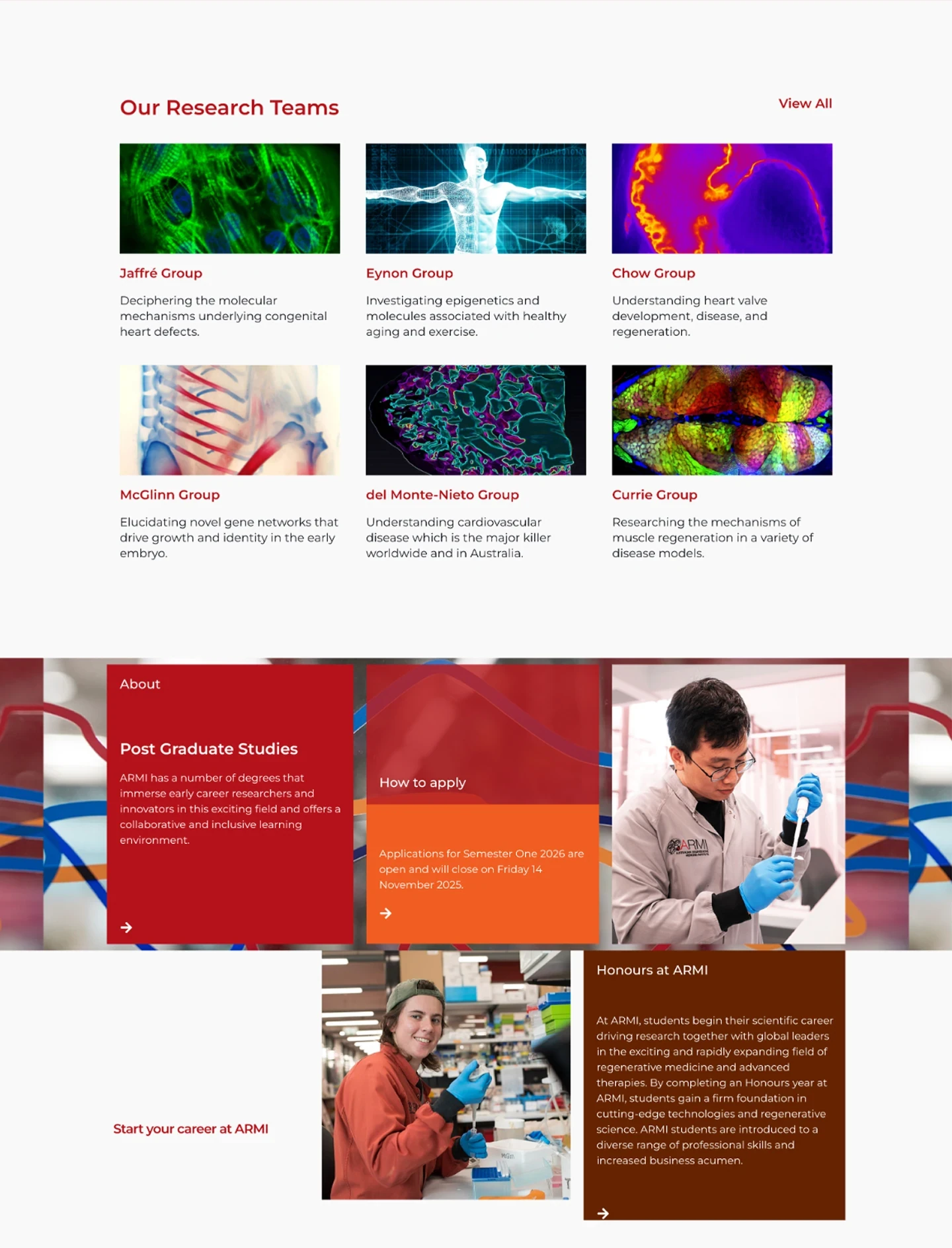
On first scroll — research teams, ahead of events and donations.

First screen - impact metrics and institutional credibility.

On first scroll — research teams, ahead of events and donations.

REFLECTION

From Design to Reality

From Design to Reality

The existing WordPress theme imposed real limitations such as button text colour couldn't be customised, and predefined templates restricted layout flexibility. Some design decisions couldn't be implemented exactly as intended. Where this happened, I adapted: outlined text-links replaced buttons to preserve visual hierarchy and clarity within what the theme could support.

My first pass at this redesign came from talking to the client alone and fixing what I could see was broken on the existing site. I kept the same IA. Something still felt off, though I couldn’t quite name it at the time. Talking to three existing users and looking at competitors changed that.
I realised the IA itself was the problem, not the surface details I’d been polishing. That’s what led me to the structure this project ended up with. I don’t think a redesign needs the same depth of user research a new product or a new assumption would. But I’ve learned it still needs some. My own experience as a designer, however informed, couldn’t cover the full range of a user’s mental model on its own.